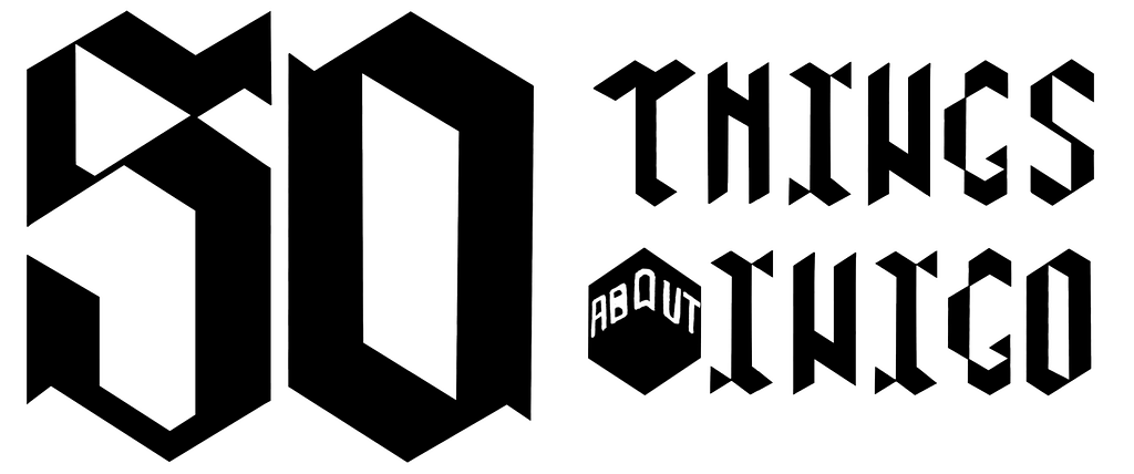
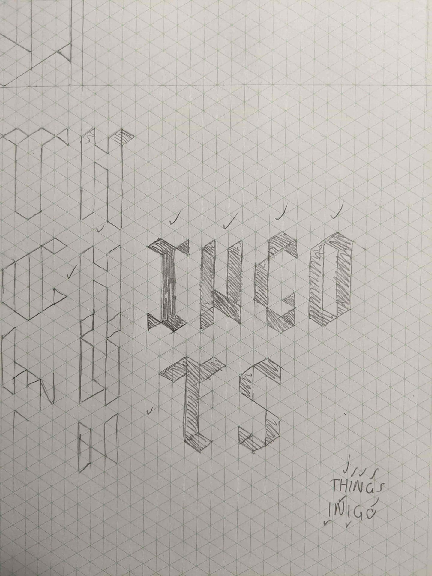
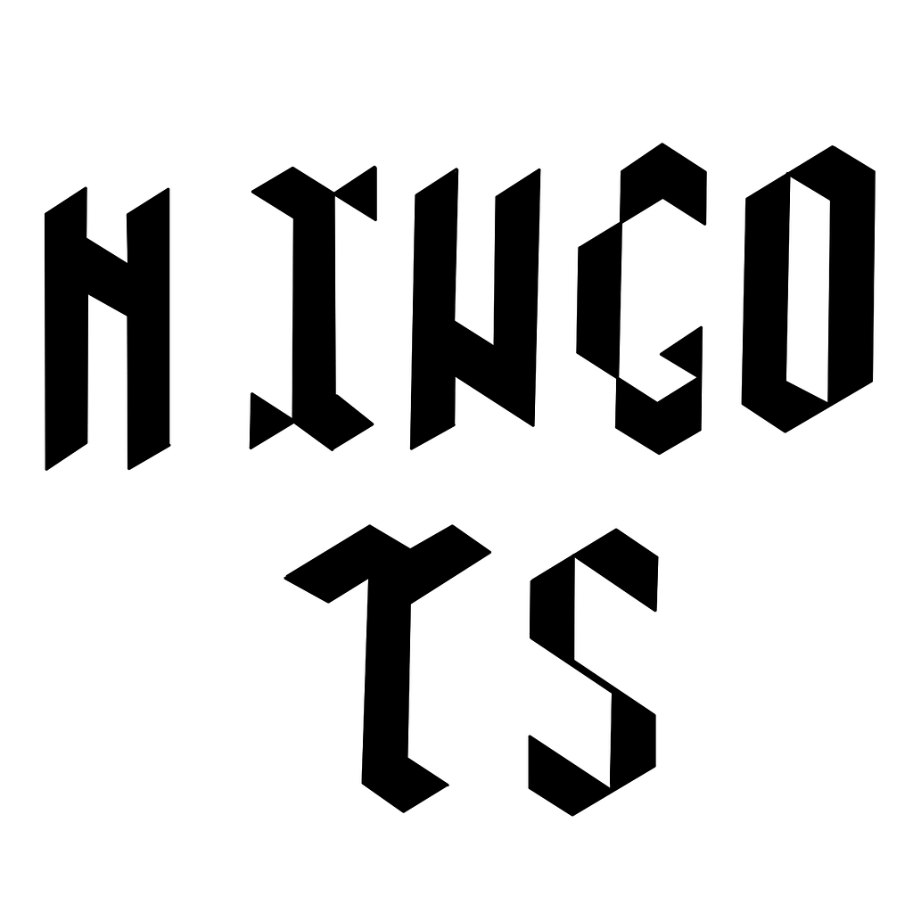
Type
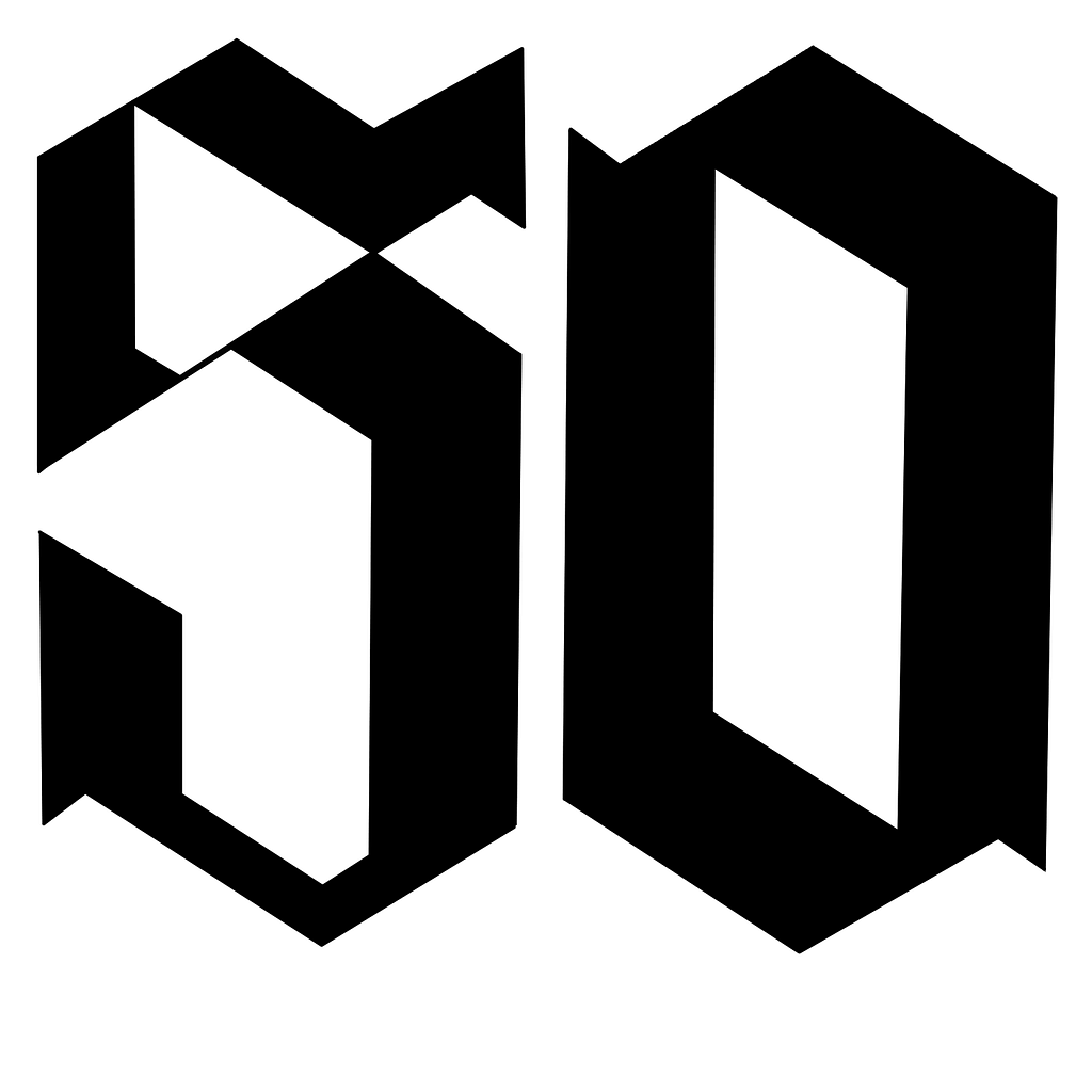
The type needed to reflect elements on the poster and isometric grid. When I was playing around with drafting styles I found they naturally took on a gothic aesthetic when using this grid.
However I had difficulty translating some elements, for example the ‘5’ ended up looking more like an ‘S’. Overall some of the type I made worked and some didn’t, but a combination of styles seemed to work well.
These experiments were loosely led by the book ‘Type and Typography’ by Phil Baines and Andrew Haslam. It encouranged me to maintain consistency in some elements whilst shifting individual parts like construction, shape, proportions and weight.
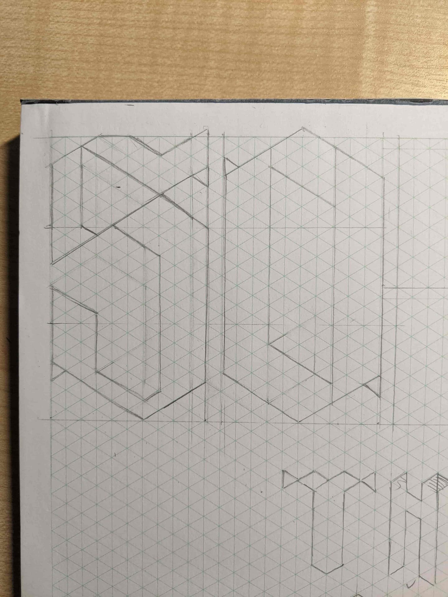
With the initial draft I considered the idea of incorporating rooms into the letter forms. However my layout was already fairly confusing, and merging the title into the main illustration likely would have disfigured the order of read.