Second Draft
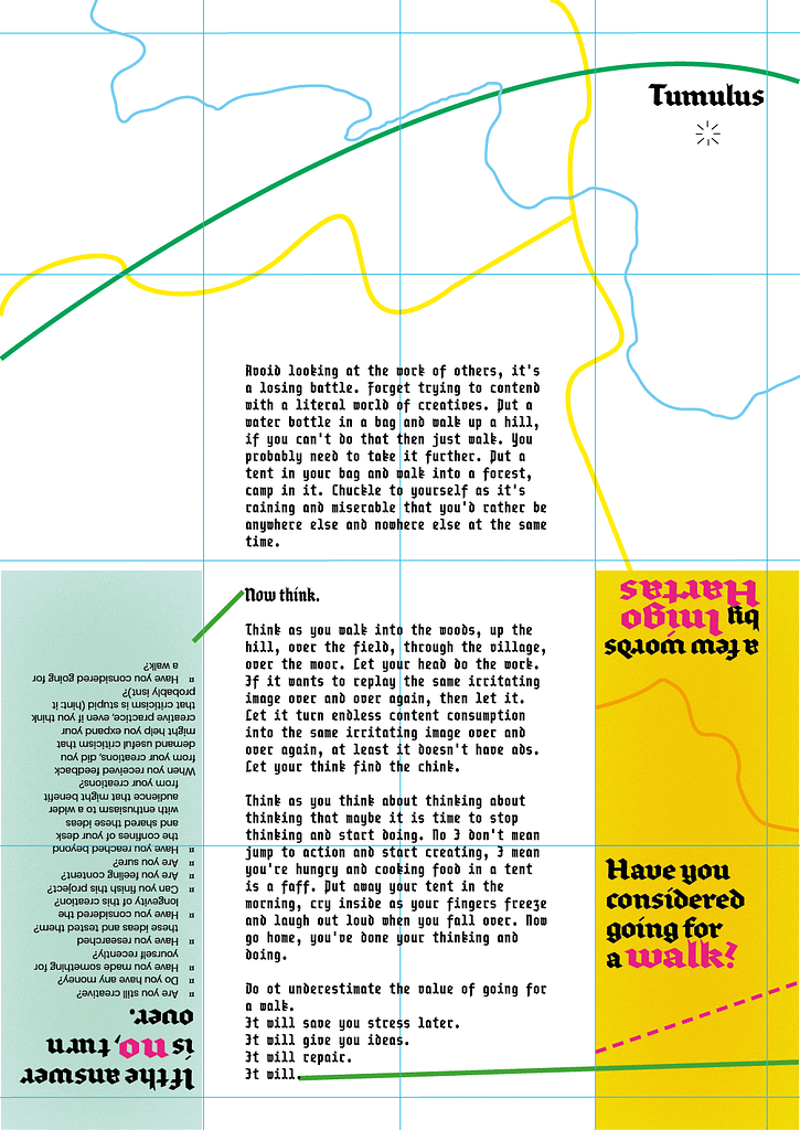
The tone of my manifesto was too casual. Whilst this might have suited a differnent style, I wanted the words of my manifesto to reflect maps – which are direct and to the point. This resulted in my removing some of the chatty language for more direct questions:
Are you still creative?
Do you have any money?
Have you made something for yourself recently?
Have you researched these ideas and tested them?
Have you considered the longevity of this creation?
Can you finish this project?
Are you feeling content?
Are you sure?
Have you reached beyond the confines of your desk and shared these ideas with enthusiasm to a wider audience that might benefit from your creations?
When you received feedback from your creations, did you demand useful criticism that might help you expand your creative practice, even if you think that criticism is stupid (hint: it probably isnt)?
Have you considered going for a walk?

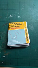
The form of the manifesto also changed, taking more direct inspiration from OS Maps. The newer version was still a pamplet, and I encouraged viewer to read it page by page, but it also folded like a map. To reflect this I also changed the name to ‘Have you considered going for a walk?’
For the second draft I started to make decisions on colour, type and layout. The colours were swatches taken from OS Maps, which were vivid and contrasting. I tried using different lines to suggest roads or landmarks, but never directly creating them – ultimately, this wasn’t an actual map and I didn’t want it to look as such.
The blackletter type was taken from old palce names on the map. I tried modernising it by giving it bright pink highlights and stretching its form. It worked in some places and not in others. For example the body text in Frankur Pragmata was too difficult to read and needed changing.
Moving forward I aimed to give the manifesto more unity when folded out as a whole, add some distinct map features and develop the background graphic.

