Visual Style Research
I want to achieve a fairly slick looking map that has a bit of a retro feel without feeling too sci-fi. This relates more to many of my ‘things’ that refer to medieval aesthetics or classic fantasy inspirations.
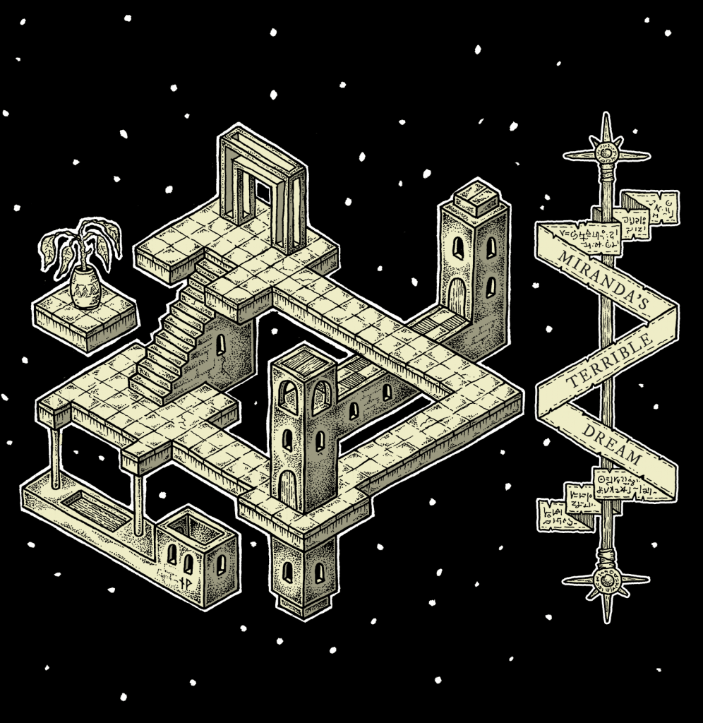
The work below by Paths Peculiar is about Miranda’s horrible dream. It is strongly inspired by the likes of M. C. Escher and Errol Otus, evident in the cyclical nature of the corridors. It’s clear and concise, but might not be effective at conveying a lot of information – especially without colour.
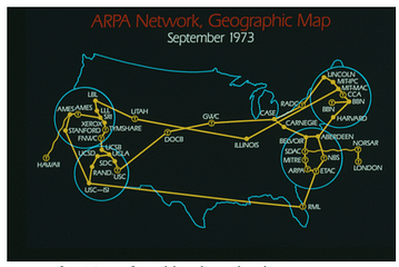
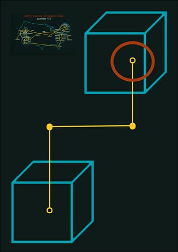
This 1970’s ARPA network graphic certainly captures a retro feeling, with its clearly distinguished primary colours. The fact that it’s one of the earliest internet networks lends to its aesthetic. I quickly mocked up a page using the colours to see if that would lead me anywhere. Ultimately, I think I will need more colours to represent different categories.