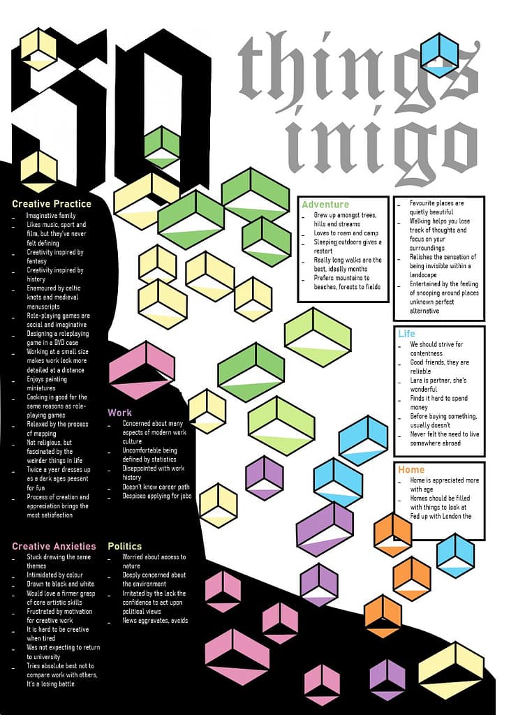
Layout Problem Solving

This is my first draft layout, and there were multiple issues highlighted during our crit session:
- ‘Cramned’ is the overall feeling
- Title dominates too much space
- Order of read is confusing and does not direct viewer down the page
- Too many categories of unequal sizes
- Body type could be more compact and organised
