
Layout Improvements
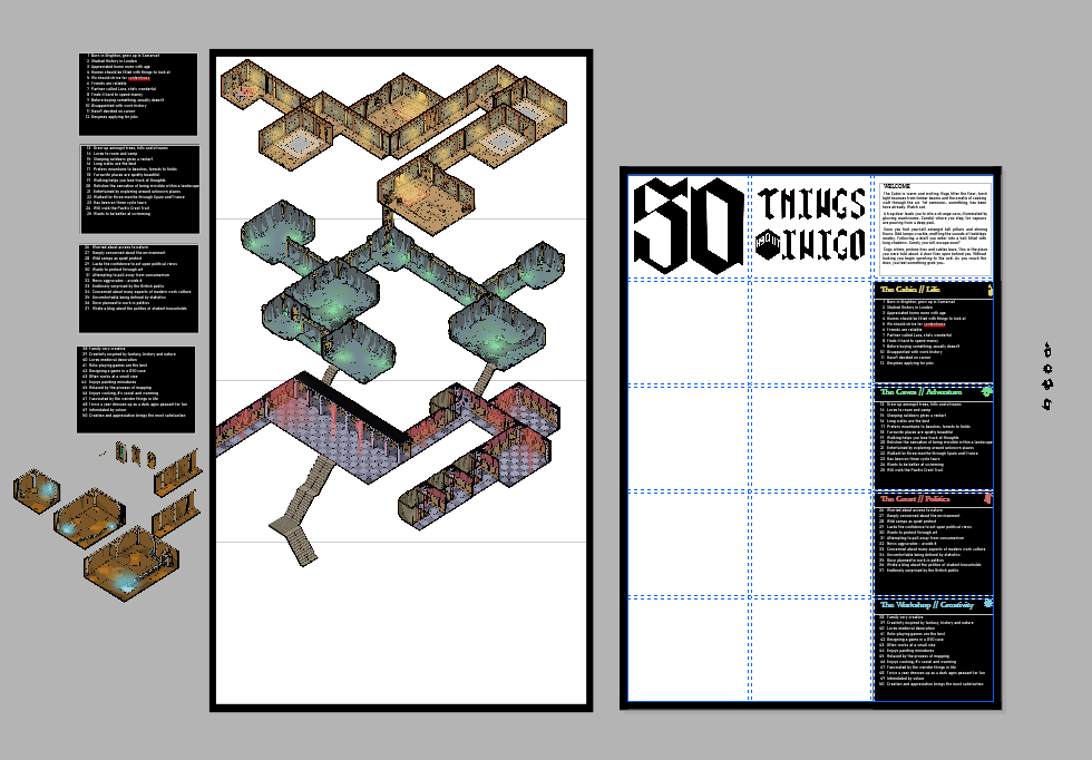
In complete contrast to the first draft, I ended up sticking to a strict grid system. This helped clearly signpost that the illustration was primary, and that you should read left-right, top-bottom. The rigidity is slightly broken up by the illustration itself, with a few corridors falling off the side.
I produced some icons to help further link the categories on the side with the map. Given more time to develop I think adding more detail to the illustration itself would help draw the viewer in.