Inspirations
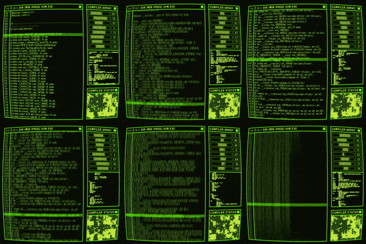
With the first draft of my manifesto I planned on presenting it as retro code. Possibly having text in a bright hazy green, flanked by a clunky UI. Following this I considered changing the name to ‘Trial and Error’, to better suit the process of answering the creative questions.


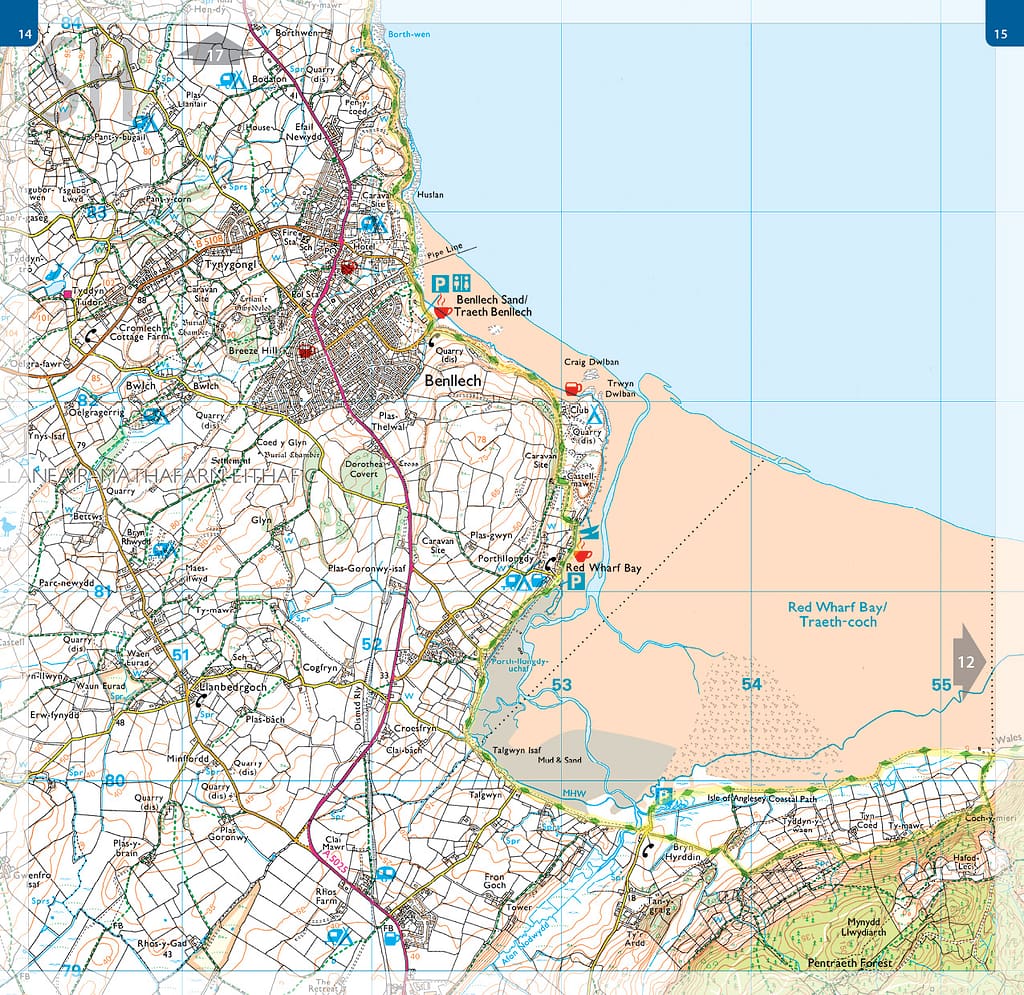
Equally I wanted to focus on the walking element of the text. Something that has supported my adventures are OS Maps, they also conveniently have an iconic aesthetic that I could borrow. I was unsure whether to reference old maps or modern ones, each having their own quirks and interesting elements. Ancient places of note are singled out using blackletter typeface on OS Maps, completely opposed to the very readable types used for place names. The way these places are presented evokes their mystery and encourages exploration.
I have scaled many barbed wire fences to reach locations simply marked as ‘tumulus’ or ‘fort’ on the map – surely I had to include that in my manifesto.

