Developing Visual Style 01
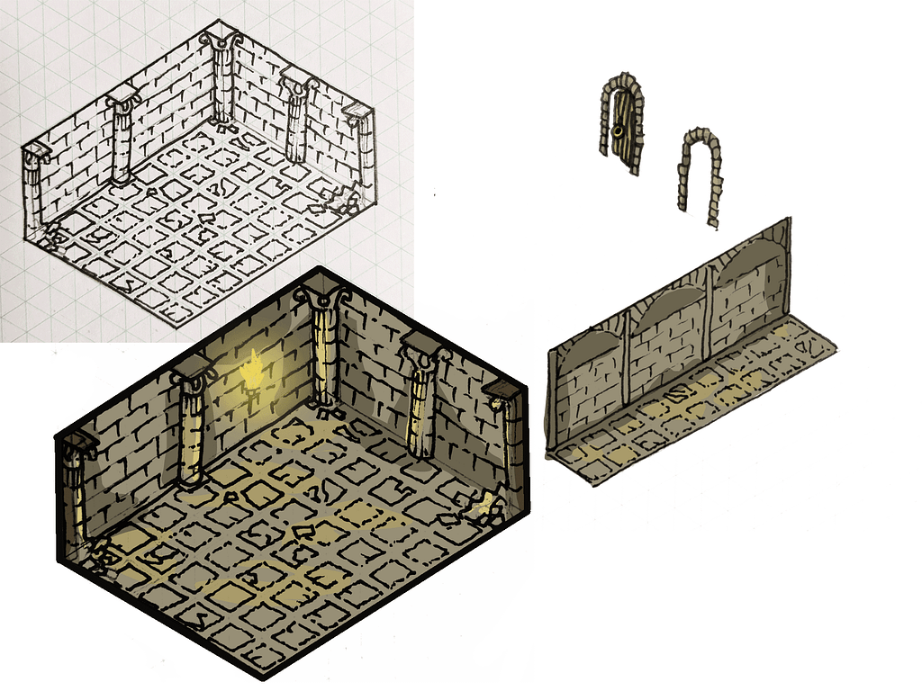
To increase the clarity of the illustration I decided that each category should have its own visual style. For example, caves for adventure, a court for politics and so on. These first tests were drawn by hand onto isometric paper, scanned, then I increased the brightness and contrast to remove the faint blue lines, afterwards I turned brightness to opacity and finally finished colouring in Clip Studio.

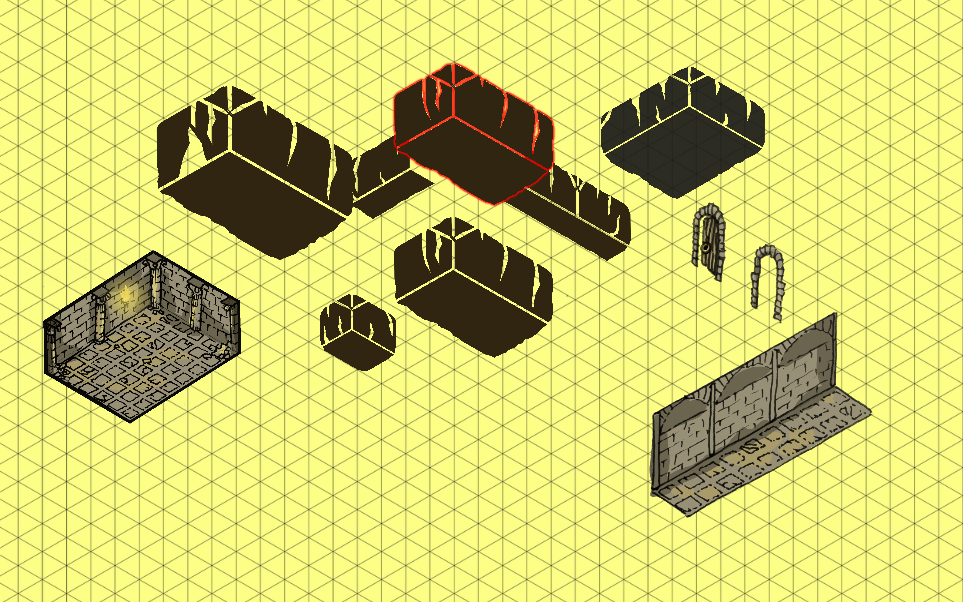
I tried another visual style using simpler shapes. Whilst this certainly could have worked I felt like it lacked much character and also drove the overall look towards sci-fi. Part of my plan at this point was to distinguish each category by the supports in the corner of each room, possibly making one angular, another curvey etc.


I came across this map in Amsterdam for a series of artist studios. This encouraged me to try the simpler style. I also like the bold layout that uses a clear grid system, though the text is too small and the key confuses me.
