by admin | Nov 13, 2022 | 50 Things About Me
This second draft is a dramatic improvement on the first. Obviously it is partly aided by the fully coloured illustration, rather than just coloured blocks, but the layout and finishing touches make it more of a visual treat. Despite the quantity of text barely being...
by admin | Nov 13, 2022 | 50 Things About Me
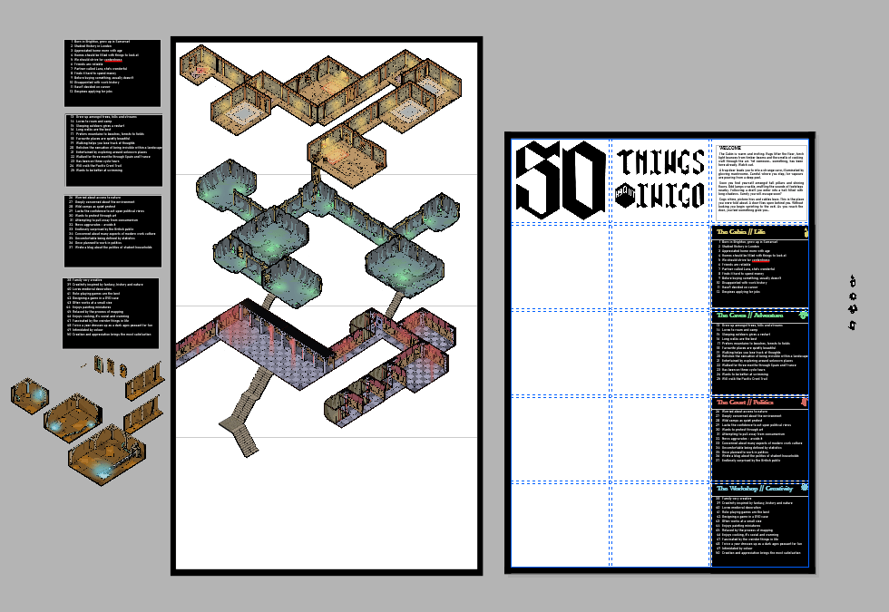
In complete contrast to the first draft, I ended up sticking to a strict grid system. This helped clearly signpost that the illustration was primary, and that you should read left-right, top-bottom. The rigidity is slightly broken up by the illustration itself, with a...

by admin | Nov 13, 2022 | 50 Things About Me
The type needed to reflect elements on the poster and isometric grid. When I was playing around with drafting styles I found they naturally took on a gothic aesthetic when using this grid. However I had difficulty translating some elements, for example the...
by admin | Nov 9, 2022 | 50 Things About Me
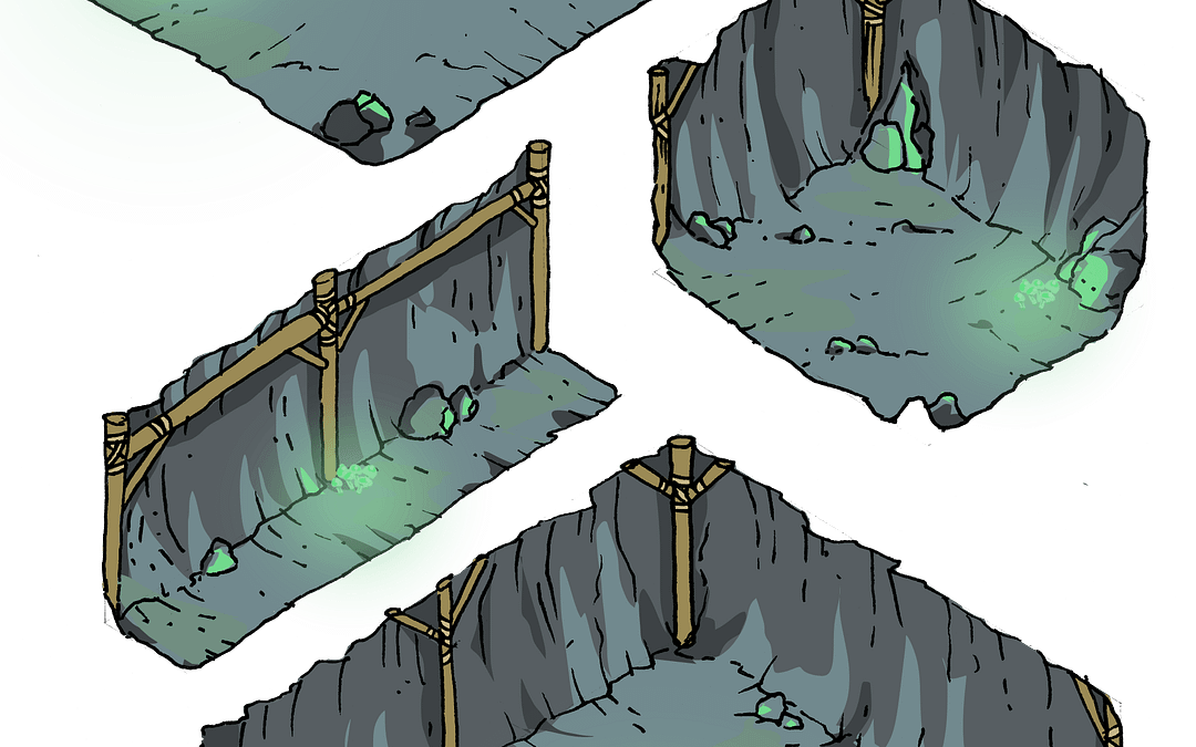
Having decided that I was going to go with a more traditional method of drawing the dungeon I could crack on. I wanted to ensure that the dungeon could be rearranged, knowing that I’d likely change my mind when I started piecing everything together. To do this I...
by admin | Nov 4, 2022 | 50 Things About Me
This is my first draft layout, and there were multiple issues highlighted during our crit session: ‘Cramned’ is the overall feeling Title dominates too much space Order of read is confusing and does not direct viewer down the page Too many categories of...
by admin | Nov 4, 2022 | 50 Things About Me
To increase the clarity of the illustration I decided that each category should have its own visual style. For example, caves for adventure, a court for politics and so on. These first tests were drawn by hand onto isometric paper, scanned, then I increased the...