50 Things About Me

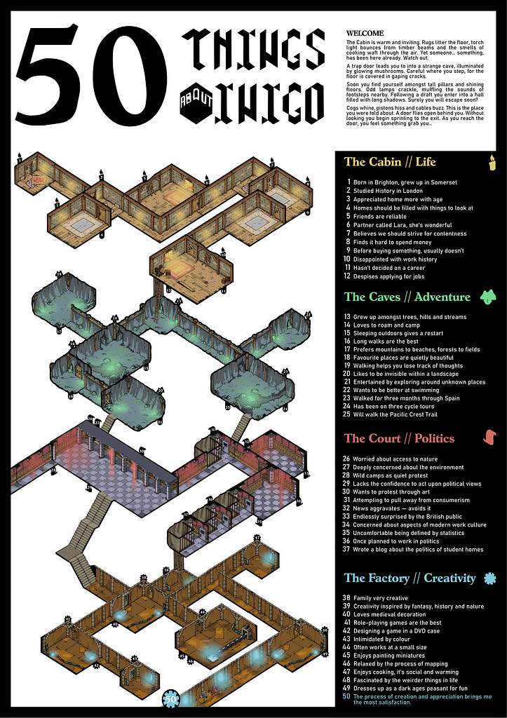
This second draft is a dramatic improvement on the first. Obviously it is partly aided by the fully coloured illustration, rather than just coloured blocks, but the layout and finishing touches make it more of a visual treat.
Despite the quantity of text barely being reduced, in this layout it manages to look far more contained and readable. The flavour text at the top allowed me to bring some more of the fantasy roleplaying game theme and helped create a bit of atmosphere for anyone bothered to read it.
Improvements I would still like to make:
- the title, whilst more readable, has some odd elements. I used the Weathered typeface that matched the subtitles. Whilst there is that continuity, it hasn’t scaled up too well and I do miss my custom type.
- body type, as pointed out in our crit session the font could align with the theme more. Currently the Bahnschrift comes across as very neutral.
- the illistration could do with some flavour added in, especially drawing in ideas from the 50 Things.
